
May 25, 2021 By: yunews
Like so many other events during the time of COVID-19, the 12th Annual Stern Senior Show 2021 has had to move its exhibition online. In “normal” times, the show would have opened at the Yeshiva University Museum on the day before the YU commencement, on May 25, 2021, in a gallery designed by the students themselves with the guidance of design faculty and museum staff.
But the senior artists, undaunted by these obstacles, managed to transition their show, titled In/Tension, to a virtual one with the help of Traci Tullius, associate professor of art, co-chair of the Department of Fine Arts and Music and director of the Studio Art program, and Mary Creede, instructor in art.
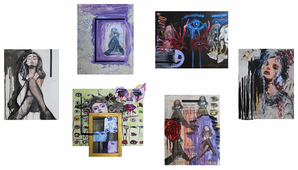
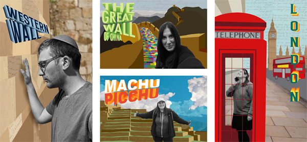
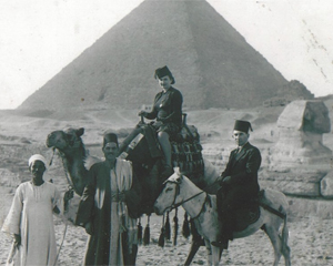 For my senior project, I created a series of five compositions inspired by an image of my great-grandmother, Mama Helen.
Using photography and graphic design, I recreated this image that was taken in front of the Pyramids of Giza in Egypt in the 1930s.
The additional four compositions depict some of her descendants. I photographed my family members, and placed them digitally in front of a widely recognized location, landmark or city. These designs are inspired by Mid-Century Modern postcards or travel posters.
When the original photo was taken, my great-grandmother was far away from home and her family. Similarly, these days it is nearly impossible for my entire family to gather together because of the COVID-19 pandemic.
The location/landmark for each design also has a personal connection; for example, my sister is placed in front of Macchu Picchu in Peru because that is one of her favorite places she has visited, and my brother is placed at the Western Wall because that’s the only place outside of America that he has ever traveled to.
Each piece includes texture, vector graphics and small pieces of a handwritten letter that my great-grandmother wrote for my mother. Through the combination of photography and design, I am bringing out some of the similarities of my great-grandmother then and the world we live in today.
For my senior project, I created a series of five compositions inspired by an image of my great-grandmother, Mama Helen.
Using photography and graphic design, I recreated this image that was taken in front of the Pyramids of Giza in Egypt in the 1930s.
The additional four compositions depict some of her descendants. I photographed my family members, and placed them digitally in front of a widely recognized location, landmark or city. These designs are inspired by Mid-Century Modern postcards or travel posters.
When the original photo was taken, my great-grandmother was far away from home and her family. Similarly, these days it is nearly impossible for my entire family to gather together because of the COVID-19 pandemic.
The location/landmark for each design also has a personal connection; for example, my sister is placed in front of Macchu Picchu in Peru because that is one of her favorite places she has visited, and my brother is placed at the Western Wall because that’s the only place outside of America that he has ever traveled to.
Each piece includes texture, vector graphics and small pieces of a handwritten letter that my great-grandmother wrote for my mother. Through the combination of photography and design, I am bringing out some of the similarities of my great-grandmother then and the world we live in today.
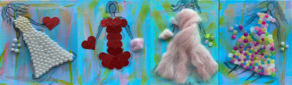
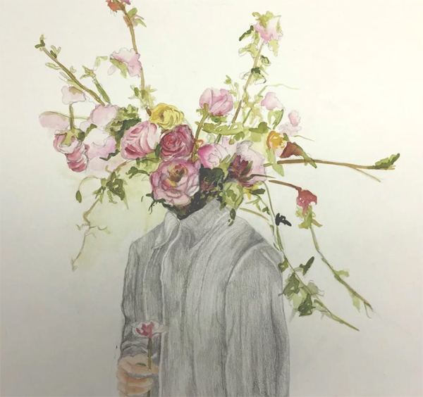
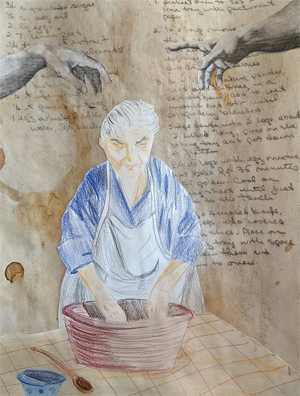 My senior project is titled “Women Without Men.” I was inspired by historical photographs featuring women. The common tie among the pictures is that the subjects’ eyes seem to cry “listen to me, I have a story to share.”
Women’s narratives are sorely lacking in the annals of history, and I would like to rectify that, to give these forgotten women a voice, even if only hypothetical. I want to illustrate that a woman doesn’t need a man to have a purpose, to have feelings and opinions worthy of being heard. I find that women often feel stifled by the presence of men, hiding their true selves behind socially appropriate behavior. I want the women in my compositions to feel free and uninhibited.
Each of my illustrations was inspired by a vintage found photograph and is accompanied by a short story or written snapshot imagining the lives and emotions of the women depicted.
The illustrations were drawn in either colored pencil or charcoal, or painted with acrylics, depending on what I felt the image required.
I want these women to feel real to the viewer, to take a black and white photograph and paint a technicolor picture of the lives they might have led.
My senior project is titled “Women Without Men.” I was inspired by historical photographs featuring women. The common tie among the pictures is that the subjects’ eyes seem to cry “listen to me, I have a story to share.”
Women’s narratives are sorely lacking in the annals of history, and I would like to rectify that, to give these forgotten women a voice, even if only hypothetical. I want to illustrate that a woman doesn’t need a man to have a purpose, to have feelings and opinions worthy of being heard. I find that women often feel stifled by the presence of men, hiding their true selves behind socially appropriate behavior. I want the women in my compositions to feel free and uninhibited.
Each of my illustrations was inspired by a vintage found photograph and is accompanied by a short story or written snapshot imagining the lives and emotions of the women depicted.
The illustrations were drawn in either colored pencil or charcoal, or painted with acrylics, depending on what I felt the image required.
I want these women to feel real to the viewer, to take a black and white photograph and paint a technicolor picture of the lives they might have led.
 My older brother’s attention to detail and innovative thinking taught me many things in life and led me to establish the philosophy for the collection that I will be sharing today.
Max’s love for fashion and innovation trickled down into the most basic items hanging in his closet. A specific blue graphic T-shirt had always stuck out to me because of the story it held. He viewed the main graphic on the tee as more captivating when worn inside-out. He would often receive comments informing him of the fact, but his response was instinctive: “It’s inside out on purpose because it looks cooler this way.”
When the shirt was eventually passed down to me, I honored the history and continued to wear it as so. When I began receiving the comments just as he did, I did not think twice before responding, “It looks cooler this way.” The instinctive and unapologetic reaction sparked the idea for a streetwear brand that revolves around garments intentionally produced to be worn inside-out.
The inspiration continues under Louis XV’s reign in 18th-century Europe when fascination with all things Asian reached its peak. With the lack of firsthand experience, the ways of the Eastern world were mysteriously intriguing. The mystique led the British and French population to embrace and, in many ways, appropriate Asian motifs in art, fashion and home furnishings.
The juxtaposition between decorative chinoiserie and explosive French fashion of the Rococo era create a detailed union, mirrored in the patterns used below. Studying the history of art at all levels aided in conducting successful primary and contemporary research in preparation for my collection.
The entirety of my fine arts education has opened my eyes to understanding the world through color theory and obscure attention to detail. The joint program between Yeshiva University and The Fashion Institute of Technology provided me with the tools to proficiently utilize the Adobe Creative Suite while simultaneously understanding the functionality of garments.
In designing and producing the It Looks Cooler this Way line, these skills allowed me to create the original hand-drawn logos, digital fashion mockups, fashion sketches, and mixed media collages. Further, I completed an independent study in ’zine-making over the past year that inspired me to incorporate an electronic catalogue of collage art as the main branding avenue for the collection.
Computer design and fashion design are both heavily founded upon precision and perception. There is a reason Max believed that wearing his shirt this way was “cooler.” It is, on a technical level, more attractive to the eye because of the subtle details it encapsulates, similar to traditional chinoiserie.
To intentionally replicate an inside-out shirt, one must study the shift in detail. When dealing with the inside-out garment, the manipulation of color presents itself as faded and lightened. To replicate this effect, I’ve applied the soft light filter to the logo at 100%-70% opacity. Further, the seams on all the garments in the collection will present as inside out, and the tags will be sewn on the outer neck. With this project, I hope to convince you that art is intelligent, just as it is a science of perception and precision.
It Looks Cooler This way, or ILCTW, is not only a brand but an ideology. It encapsulates living unapologetically through detailed function. We, as humans, must not fear the reaction we may get when attempting authenticity but thrive off of it. Make the active decision every day to think differently because it’s cooler this way.
My older brother’s attention to detail and innovative thinking taught me many things in life and led me to establish the philosophy for the collection that I will be sharing today.
Max’s love for fashion and innovation trickled down into the most basic items hanging in his closet. A specific blue graphic T-shirt had always stuck out to me because of the story it held. He viewed the main graphic on the tee as more captivating when worn inside-out. He would often receive comments informing him of the fact, but his response was instinctive: “It’s inside out on purpose because it looks cooler this way.”
When the shirt was eventually passed down to me, I honored the history and continued to wear it as so. When I began receiving the comments just as he did, I did not think twice before responding, “It looks cooler this way.” The instinctive and unapologetic reaction sparked the idea for a streetwear brand that revolves around garments intentionally produced to be worn inside-out.
The inspiration continues under Louis XV’s reign in 18th-century Europe when fascination with all things Asian reached its peak. With the lack of firsthand experience, the ways of the Eastern world were mysteriously intriguing. The mystique led the British and French population to embrace and, in many ways, appropriate Asian motifs in art, fashion and home furnishings.
The juxtaposition between decorative chinoiserie and explosive French fashion of the Rococo era create a detailed union, mirrored in the patterns used below. Studying the history of art at all levels aided in conducting successful primary and contemporary research in preparation for my collection.
The entirety of my fine arts education has opened my eyes to understanding the world through color theory and obscure attention to detail. The joint program between Yeshiva University and The Fashion Institute of Technology provided me with the tools to proficiently utilize the Adobe Creative Suite while simultaneously understanding the functionality of garments.
In designing and producing the It Looks Cooler this Way line, these skills allowed me to create the original hand-drawn logos, digital fashion mockups, fashion sketches, and mixed media collages. Further, I completed an independent study in ’zine-making over the past year that inspired me to incorporate an electronic catalogue of collage art as the main branding avenue for the collection.
Computer design and fashion design are both heavily founded upon precision and perception. There is a reason Max believed that wearing his shirt this way was “cooler.” It is, on a technical level, more attractive to the eye because of the subtle details it encapsulates, similar to traditional chinoiserie.
To intentionally replicate an inside-out shirt, one must study the shift in detail. When dealing with the inside-out garment, the manipulation of color presents itself as faded and lightened. To replicate this effect, I’ve applied the soft light filter to the logo at 100%-70% opacity. Further, the seams on all the garments in the collection will present as inside out, and the tags will be sewn on the outer neck. With this project, I hope to convince you that art is intelligent, just as it is a science of perception and precision.
It Looks Cooler This way, or ILCTW, is not only a brand but an ideology. It encapsulates living unapologetically through detailed function. We, as humans, must not fear the reaction we may get when attempting authenticity but thrive off of it. Make the active decision every day to think differently because it’s cooler this way.
Frida Bassan
Rena Cantor
Neriah Hadad
Shira Levitt
Decadent Coffee Co.
Adena Loboda
For my senior project, I created a series of five compositions inspired by an image of my great-grandmother, Mama Helen.
Using photography and graphic design, I recreated this image that was taken in front of the Pyramids of Giza in Egypt in the 1930s.
The additional four compositions depict some of her descendants. I photographed my family members, and placed them digitally in front of a widely recognized location, landmark or city. These designs are inspired by Mid-Century Modern postcards or travel posters.
When the original photo was taken, my great-grandmother was far away from home and her family. Similarly, these days it is nearly impossible for my entire family to gather together because of the COVID-19 pandemic.
The location/landmark for each design also has a personal connection; for example, my sister is placed in front of Macchu Picchu in Peru because that is one of her favorite places she has visited, and my brother is placed at the Western Wall because that’s the only place outside of America that he has ever traveled to.
Each piece includes texture, vector graphics and small pieces of a handwritten letter that my great-grandmother wrote for my mother. Through the combination of photography and design, I am bringing out some of the similarities of my great-grandmother then and the world we live in today.
Dassie Okin
My senior project is titled “Women Without Men.” I was inspired by historical photographs featuring women. The common tie among the pictures is that the subjects’ eyes seem to cry “listen to me, I have a story to share.”
Women’s narratives are sorely lacking in the annals of history, and I would like to rectify that, to give these forgotten women a voice, even if only hypothetical. I want to illustrate that a woman doesn’t need a man to have a purpose, to have feelings and opinions worthy of being heard. I find that women often feel stifled by the presence of men, hiding their true selves behind socially appropriate behavior. I want the women in my compositions to feel free and uninhibited.
Each of my illustrations was inspired by a vintage found photograph and is accompanied by a short story or written snapshot imagining the lives and emotions of the women depicted.
The illustrations were drawn in either colored pencil or charcoal, or painted with acrylics, depending on what I felt the image required.
I want these women to feel real to the viewer, to take a black and white photograph and paint a technicolor picture of the lives they might have led.
Goldie Sion
Chana Tropper
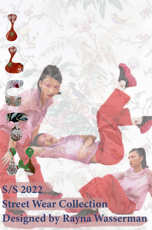
Rayna Wasserman
My older brother’s attention to detail and innovative thinking taught me many things in life and led me to establish the philosophy for the collection that I will be sharing today.
Max’s love for fashion and innovation trickled down into the most basic items hanging in his closet. A specific blue graphic T-shirt had always stuck out to me because of the story it held. He viewed the main graphic on the tee as more captivating when worn inside-out. He would often receive comments informing him of the fact, but his response was instinctive: “It’s inside out on purpose because it looks cooler this way.”
When the shirt was eventually passed down to me, I honored the history and continued to wear it as so. When I began receiving the comments just as he did, I did not think twice before responding, “It looks cooler this way.” The instinctive and unapologetic reaction sparked the idea for a streetwear brand that revolves around garments intentionally produced to be worn inside-out.
The inspiration continues under Louis XV’s reign in 18th-century Europe when fascination with all things Asian reached its peak. With the lack of firsthand experience, the ways of the Eastern world were mysteriously intriguing. The mystique led the British and French population to embrace and, in many ways, appropriate Asian motifs in art, fashion and home furnishings.
The juxtaposition between decorative chinoiserie and explosive French fashion of the Rococo era create a detailed union, mirrored in the patterns used below. Studying the history of art at all levels aided in conducting successful primary and contemporary research in preparation for my collection.
The entirety of my fine arts education has opened my eyes to understanding the world through color theory and obscure attention to detail. The joint program between Yeshiva University and The Fashion Institute of Technology provided me with the tools to proficiently utilize the Adobe Creative Suite while simultaneously understanding the functionality of garments.
In designing and producing the It Looks Cooler this Way line, these skills allowed me to create the original hand-drawn logos, digital fashion mockups, fashion sketches, and mixed media collages. Further, I completed an independent study in ’zine-making over the past year that inspired me to incorporate an electronic catalogue of collage art as the main branding avenue for the collection.
Computer design and fashion design are both heavily founded upon precision and perception. There is a reason Max believed that wearing his shirt this way was “cooler.” It is, on a technical level, more attractive to the eye because of the subtle details it encapsulates, similar to traditional chinoiserie.
To intentionally replicate an inside-out shirt, one must study the shift in detail. When dealing with the inside-out garment, the manipulation of color presents itself as faded and lightened. To replicate this effect, I’ve applied the soft light filter to the logo at 100%-70% opacity. Further, the seams on all the garments in the collection will present as inside out, and the tags will be sewn on the outer neck. With this project, I hope to convince you that art is intelligent, just as it is a science of perception and precision.
It Looks Cooler This way, or ILCTW, is not only a brand but an ideology. It encapsulates living unapologetically through detailed function. We, as humans, must not fear the reaction we may get when attempting authenticity but thrive off of it. Make the active decision every day to think differently because it’s cooler this way.